GTCS Game Engine:
UI Tutorial
Note: These UI Objects are enhancements and in addition to the V2 UI Objects.
You can try the demo for the UI objects here.
Introduction
This tutorial will cover the new UI Objects added. It will explain how to set up and use each of the UI Objects.
UI Objects: UI Button • UI Sprite Button • UI Bar • UI Slider • UI Toggle • UI Switch Toggle
Common Variables
position - a 2 entry array that takes the PIXEL position of the object
size - a 2 entry array that takes the PIXEL position of the object
color - a 4 entry array that controls the color of the object.
text - string for the object to display
textSize - a single number that controls the height of text
stencil - a renderable that is used in the draw call of several UI objects for stenciling
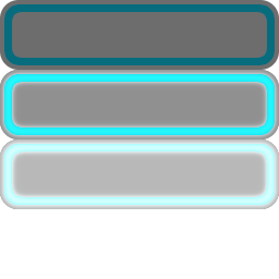
UI Text
This form of button uses solid colors and a stencil. To have more customized buttons, sprite buttons should be used.

MyGame.prototype.initialize = function(){
	this.UIButton = new UIButton(callback, context, position, size, text, textSize);
};
callback - sets the function to be called when the button is clicked
context - is which object the callback belongs to (e.g. if we want to call this.backSelect(), then backSelect is the callback and this is the context
Useful functions:
setTextColor - sets the normal color of the text
setHoverTextColor - sets the text color for when the button is hovered over
setClickTextColor - sets the color of the text for when the button is clicked
setBGColor - sets the normal color of the button's background
setBGHoverColor - sets the background's color for when the button is hovered over
setBGClickColor - sets the color of the background for when the button is clicked
setStencil sets - the stencil to be used when drawing
UI Sprite Button
This form of button uses a sprite image to allow for more customized buttons. It does not use a stencil.
MyGame.prototype.initialize = function(){
	this.UISpriteButton = new UISpriteButton(buttonSprite, callback, context, position, size, text, textSize);
};
buttonSprite - the sprite to be used for the button. There are four parts to the sprite: normal button sprite, hovered over button sprite, clicked button sprite, and an empty slot (since the sprite needs to be a power of 2 and it's easier to devide the UV by 4 than by 3).
callback and context are same as in UI Button
Useful functions:
setTextColor - sets the normal color of the text
setHoverTextColor - sets the text color for when the button is hovered over
setClickTextColor - sets the color of the text for when the button is clicked
setBGNormalUVs - sets the UVs of the buttonSprite that will be used when there is no interaction between the button and mouse
setBGHoverUVs - sets the UVs to be used for when the button is hovered over
setBGClickUVs - sets the UVs to be used when the button is clicked
UI Bar
Bars primarily consist of three elements: background (bg), middle (mid), and top. These element names refer to which element is drawn before another. Bars also use solid colors and a stencil for drawing. Basic on the given size, a bar will function horizontally or vertically.

MyGame.prototype.initialize = function(){
	this.UIBar = new UIBar(position, size);
};
Useful functions:
setMaxValue - sets the maximum value of the bar (note: the minimum of the bar is always 0)
getMaxValue - returns the maximum value
setCurrentValue - sets the current value of the bar
getCurrentValue - returns the current value of the bar
incCurrentValue - increments the current value of the bar by a given value (positive or negative)
setBGVisible - sets whether the bar's background should be drawn
setMidVisible - sets whether the bar's middle element should be drawn
setBGColor - sets the background's color
setMidElemColor - sets the middle elements's color
setTopElemColor - sets the top elements's color
setStencil - sets the stencil to be used when drawing
setStencilUV - sets the UVs of the stencil
setSnapIncrease - sets whether or not the top element should jump when the bar's value is increasing
configInterpolation - sets the cycles and rate of the interpolated movement. Setting the cycles to 1 will turn off interpollation.
UI Slider
Sliders share some variables and functions as bars but add a handle for user input.

MyGame.prototype.initialize = function(){
	this.UISlider = new UISlider(position, size);
};
Useful functions:
setMaxValue - sets the maximum value of the bar (note: the minimum of the bar is always 0)
getMaxValue - returns the maximum value
setCurrentValue - sets the current value of the bar
getCurrentValue - returns the current value of the bar
setHandleTexture - sets the image to be used for the handle
setHandleSize - sets the size of the handle
setHandleColor - sets the handles's color
setBGColor - sets the background's color
setColor - sets the color of the slider's top element
setTextXOffset - sets how far the text should be from the slider on the x axis
setTextColor - sets the color of the Text
setTextSize - sets the size of the text
setTextVisible - sets whether or not to show the text
setToFixedValue - sets how many decimal places should be shown when showing text (e.g. to fixed value of 2 shows to the tenths place, to fixed value of 0 does not show any decimal places)
setSnap - sets whether or not the slider handle should snap to certain increments
setSnapBy - sets the value by which the slider should snap (e.g. if snap by is to 0.5, slider will snap to nearest half so 1.2 would snap to 1 and 1.7 would snap to 1.5)
setMultiplier - sets a multiplier to be used for when displaying text (e.g. if the max value of the slider is 1 and it should appear to the user that the max is 100, the multiplier needs to be set to 100)
UI Toggle
Toggles let a user select from a list of options.

MyGame.prototype.initialize = function(){
	this.UIToggle = new UIToggle(position, size, optionTexts, textSize);
};
optionTexts - an array of strings to be displayed as the options for which the user can pick from
Useful functions:
getCurValue - returns the index of the currently selected option (note: keep in mind the first option has an index of 0)
setBGColor - sets the color of the toggle's background
setSelectionColor - sets the color to be used to show which option in selected
setNormalTextColor - sets the color for the text to be used for non-selected options
setSelectedTextColor - sets the color for the text to be used by the selected option
configInterpolation - sets the cycles and rate of the interpolated movement. Setting the cycles to 1 will turn off interpollation.
UI Switch Toggle
Switch toggles are a two state UI object (like a light switch).

MyGame.prototype.initialize = function(){
	this.UISwitchToggle = new UISwitchToggle(position, size);
};
Useful functions:
setHandleTexture - sets the image to be used for the handle
setHandleSize - sets the size of the handle
setHandleColor - sets the handles's color
setBGColor - sets the background's color
setColor - sets the color of the switch toggles's top element
setState - sets the current state of the switch toggle
getState - returns the current state of the toggle (note: this is a boolean value)
Conclusion
These UI objects allow for a variety of ways for your user to interact with your game. They are customizable to fit the style of your game be it just through a color scheme or custom spites.
For information on support for text box (text input) and drop-down menu please ref to: here.